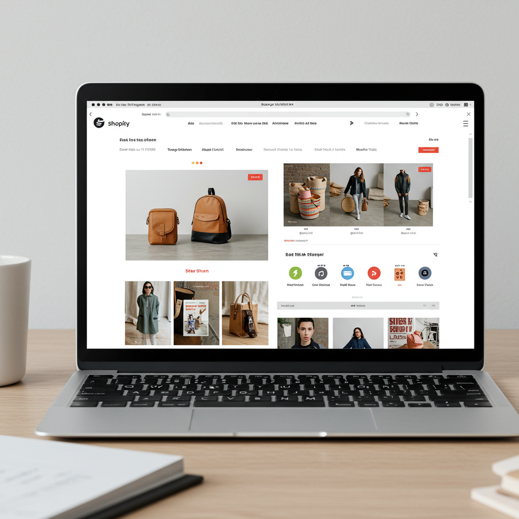
My Essential Guide to Captivating Customers with Stunning Online Displays
As a merchant, I’ve learned that running a successful Shopify store isn’t just about having great products; it’s about how you present them. Visual merchandising is the art and science of displaying your products in a way that entices customers and encourages purchases.
Think of your Shopify store as your digital storefront. Just like a physical boutique, its appearance dictates the first impression, sets the mood, and guides the customer’s journey. I believe this is where many online businesses can truly shine.
My first tip, and perhaps the most critical, revolves around **high-quality product photography**. This isn’t just a suggestion; it’s a necessity. Your customers can’t touch or feel your products online, so your images are their primary interaction.
I always recommend investing in professional photography or learning the basics of good lighting and composition yourself. Crisp, clear, well-lit images from multiple angles are non-negotiable for me.
Consider lifestyle shots too. I’ve seen a significant uplift in engagement when products are shown in context, demonstrating how they fit into a customer’s life. This helps them visualize ownership.
**Consistency in your visual branding** is another cornerstone. Your brand’s colors, fonts, and overall aesthetic should be cohesive across every page of your Shopify store. This builds trust and reinforces your identity.
I use a consistent color palette and typography that reflects my brand’s personality. This creates a professional and memorable experience for my visitors, making my store feel unified.
Next, let’s talk about your **homepage**. This is often the digital equivalent of your shop window. I ensure my hero banner is compelling, showcasing my best sellers or current promotions with stunning visuals.
Below the hero, I strategically place featured collections, new arrivals, and perhaps a section highlighting my brand’s story or values, all supported by strong imagery.
**Product page optimization** is where the magic happens. Beyond the main product images, I make sure to include detailed descriptions that are easy to read, perhaps using bullet points or bold text to break up large blocks.
I also integrate videos or 360-degree views where possible. These immersive elements provide a richer understanding of the product, which I’ve found significantly reduces returns.
For **collection pages**, I focus on clear organization. My customers should be able to quickly browse and filter products without feeling overwhelmed. I use clear product thumbnails and consistent naming conventions.
I’ve found that implementing robust filtering and sorting options is crucial. This empowers customers to find exactly what they’re looking for, improving their shopping experience and my conversion rates.
**Mobile responsiveness** is no longer optional; it’s paramount. I regularly check how my store looks and functions on various mobile devices. A beautiful desktop site means nothing if it’s clunky on a phone.
I prioritize a clean, uncluttered layout for mobile users, ensuring images load quickly and navigation is intuitive. My goal is always a seamless experience, regardless of the device.
**Strategic use of white space** is a visual merchandising technique I swear by. It prevents your pages from looking cluttered and allows your products to breathe, drawing attention to what matters most.
I also pay close attention to **call-to-action (CTA) buttons**. They need to stand out visually, with contrasting colors and clear, concise text like “Add to Cart” or “Shop Now.” Their placement is key.
**Social proof**, like customer reviews and user-generated content (UGC), is incredibly powerful. I integrate these visually, often with star ratings directly on product listings and dedicated sections for testimonials.
Seeing real people use my products builds immense trust. I encourage customers to share photos and videos, and I proudly display them on my site, often creating a dedicated gallery.
**Cross-selling and upselling** are not just sales tactics; they’re visual opportunities. I use “You might also like” or “Complete the look” sections with appealing product recommendations, often with complementary visuals.
This not only increases average order value but also helps customers discover related items they might love, enhancing their overall shopping experience with my brand.
Don’t forget **seasonal and thematic merchandising**. I adapt my store’s visuals for holidays, sales events, or new product launches. This keeps my store fresh and relevant, creating a sense of urgency or excitement.
This might involve updating banners, creating special collection pages, or even subtle changes to my site’s color accents to reflect the season. It’s about creating an engaging atmosphere.
Finally, I always emphasize **testing and iterating**. What works for one store might not work for another. I use A/B testing for different image layouts, CTA colors, or banner designs to see what resonates best with my audience.
Data from my Shopify analytics guides my visual merchandising decisions. I look at bounce rates, time on page, and conversion rates to understand how my visual choices are impacting customer behavior.
What do you think about these tips? Have you found similar strategies effective in your own Shopify store? I’d love to hear your thoughts.
In conclusion, visual merchandising on Shopify is an ongoing process of refinement and creativity. By focusing on high-quality visuals, consistent branding, and a seamless user experience, I believe any merchant can transform their online store into a captivating shopping destination.
It’s about telling your brand’s story visually and making it irresistible for your customers to explore and purchase. I encourage you to start implementing these strategies today and watch your store flourish.


