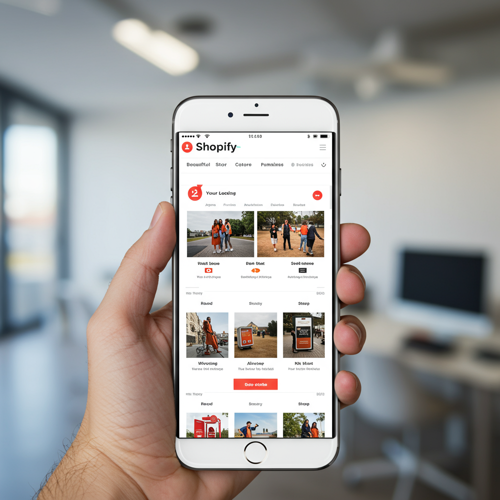
My journey and insights into building an e-commerce presence optimized for the modern mobile shopper.
As an e-commerce merchant, I’ve seen firsthand how rapidly the landscape of online shopping has evolved. It wasn’t long ago that desktop was king, but today, the vast majority of my customers are browsing and buying directly from their smartphones.
This shift isn’t just a trend; it’s the new standard. That’s why, for me, designing a mobile-first Shopify store isn’t just a good idea—it’s an absolute necessity for success.
When I talk about ‘mobile-first,’ I’m not simply referring to a responsive design that adapts to smaller screens. I mean building your store with the mobile user experience as the primary consideration from the very beginning.
It’s about prioritizing speed, clarity, and ease of use for someone on the go, often with limited attention span and potentially slower internet connections.
My approach with Shopify has always been to leverage its powerful platform to create an intuitive and seamless mobile journey. Shopify, thankfully, provides an excellent foundation for this.
The first principle I always focus on is speed. A slow-loading mobile site is a death sentence for conversions. Users expect instant gratification, and even a few seconds of delay can lead to abandonment.
To achieve this, I meticulously optimize all my images. Shopify’s built-in image optimization helps, but I also use external tools to compress images further without sacrificing quality before uploading them.
Choosing a lightweight, performance-optimized Shopify theme is also crucial. I always look for themes known for their speed and clean code, avoiding overly complex designs that might bog down mobile performance.
Next, I prioritize responsive design, but with a mobile-first mindset. This means I design for the smallest screen first, ensuring all elements are perfectly laid out and functional on a phone.
Then, I scale up to tablet and desktop. This ensures that the core experience is solid on mobile, rather than trying to cram a desktop design onto a small screen.
Navigation is another critical area for mobile. I aim for extreme simplicity. A cluttered menu is a nightmare on a small screen.
I typically opt for a clean, intuitive hamburger menu, ensuring that the most important categories are easily accessible within one or two taps. Sticky headers can also be very effective for keeping navigation visible.
Touch targets are often overlooked. On mobile, users are tapping with their fingers, not clicking with a precise mouse cursor. I make sure all buttons, links, and interactive elements are large enough and have sufficient spacing around them.
This prevents accidental taps and frustration. Think about the size of a thumb; your buttons should accommodate it comfortably.
Forms and input fields also require special attention. I ensure that all forms, from newsletter sign-ups to checkout fields, are easy to fill out on a mobile device.
This includes using appropriate keyboard types (e.g., numeric for phone numbers), auto-fill suggestions, and clear, concise labels. Minimizing the number of required fields is also a big win.
Imagery, while needing to be optimized for speed, must also be compelling. High-quality product photos are essential, but I ensure they are cropped and displayed effectively on mobile screens.
I also consider how product galleries and zoom features work on touchscreens, making sure they are intuitive and responsive to gestures.
The checkout process is arguably the most critical part of the mobile shopping experience. Shopify’s native checkout is already highly optimized for mobile, which is a huge advantage.
However, I still review it regularly, ensuring there are no unnecessary steps, that payment options are clearly presented, and that the entire flow is as frictionless as possible.
Beyond the basics, I explore Shopify apps that enhance the mobile experience. This might include apps for quick view, sticky add-to-cart buttons, or even augmented reality (AR) features for product visualization.
I also consider personalization. Leveraging customer data to show relevant products or offers can significantly improve the mobile shopping journey, making it feel tailored to the individual.
Regular testing on various mobile devices and operating systems is non-negotiable for me. I don’t just rely on emulators; I test on actual phones to catch any real-world glitches or usability issues.
Finally, I constantly monitor my mobile analytics. I look at bounce rates, conversion rates, and time on site specifically for mobile users. This data guides my continuous optimization efforts.
Building a mobile-first Shopify store is an ongoing process, not a one-time task. The digital landscape is always changing, and so too should your store.
The effort I put into optimizing for mobile always pays off in higher conversions, happier customers, and ultimately, a more successful business.
What do you think about this article? I’d love to hear your thoughts and experiences with mobile-first design.
Embracing a mobile-first strategy has been transformative for my e-commerce business, and I’m confident it can be for yours too. It’s about meeting your customers where they are, on the devices they use most.


