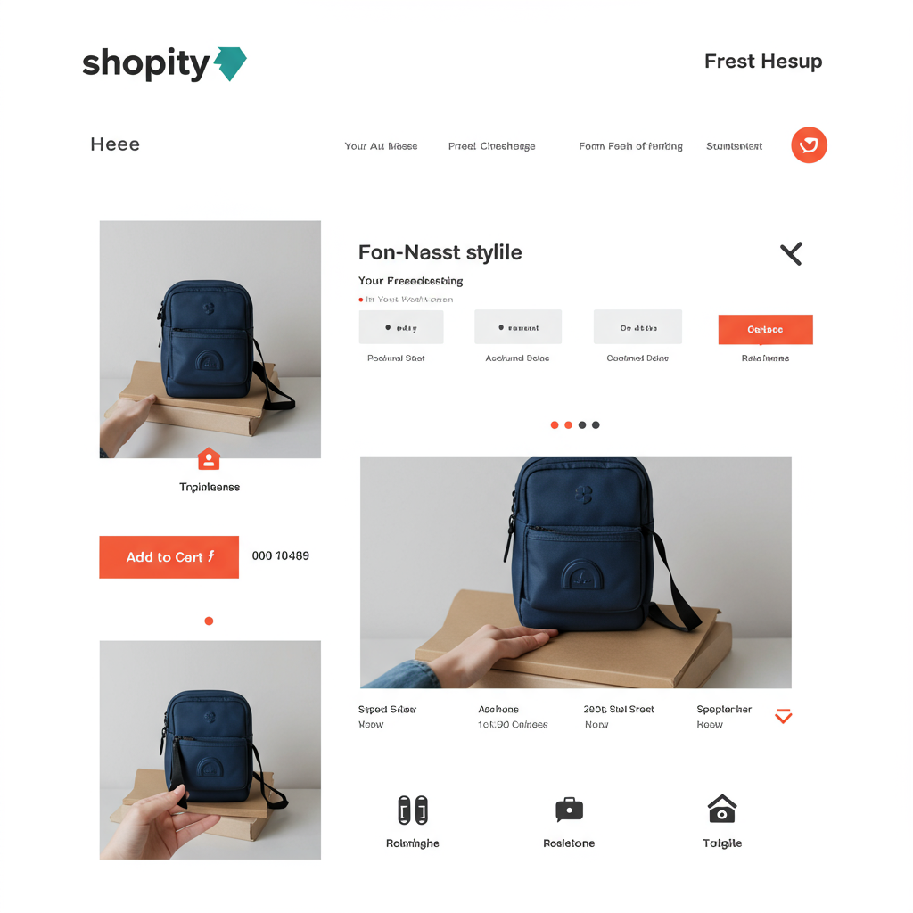
Unlock the secrets to designing high-converting product pages that captivate your customers and drive sales.
As a Shopify merchant, I know firsthand that your product pages are the heart of your online store. They’re not just digital shelves; they’re your primary sales tool, the place where potential customers make the crucial decision to buy.
A well-designed product page doesn’t just showcase your items; it tells a story, builds trust, and guides your visitors seamlessly towards a purchase. It’s where all your marketing efforts culminate.
Today, I want to share with you my top tips for optimizing your Shopify product pages. My goal is to help you transform them from mere listings into powerful conversion machines that truly resonate with your audience.
First and foremost, let’s talk about visuals. High-quality product images and videos are non-negotiable. They are the closest your customers will get to experiencing your product in person before it arrives at their doorstep.
Invest in professional photography. Use multiple angles, lifestyle shots, and close-ups to highlight textures and details. Remember, customers can’t touch or feel your product online, so your images must convey its quality and appeal.
Consider adding product videos. A short, engaging video can demonstrate how a product works, its scale, or its unique features in a way that static images simply cannot. This significantly enhances the user experience and builds confidence.
Next up is your product description. This isn’t just a list of features; it’s your opportunity to sell the dream. Focus on benefits, not just specifications. How will this product improve your customer’s life? What problem does it solve?
Use compelling, persuasive language. Tell a story about your product. Imagine your ideal customer and write directly to them, addressing their needs and desires. Break up long paragraphs with bullet points for readability.
Incorporate relevant keywords naturally within your description to help with search engine optimization (SEO). This ensures that when potential customers search for products like yours, your page has a better chance of appearing.
Your Call-to-Action (CTA) button is arguably the most important element on the page. It needs to be prominent, clear, and enticing. “Add to Cart” is standard, but ensure its color contrasts with the background and it’s easily clickable.
Don’t hide your CTA. It should be above the fold on desktop and immediately visible on mobile. Make it easy for customers to take the next step once they’ve decided to buy.
Social proof is incredibly powerful. Customer reviews and testimonials build trust and credibility. Integrate a review app like Loox or Judge.me to collect and display authentic feedback directly on your product pages.
Encourage customers to leave reviews, perhaps with a follow-up email after purchase. User-generated content, such as photos of customers using your product, can be even more persuasive than professional shots.
Displaying trust badges, such as secure payment icons (Visa, Mastercard, PayPal) or guarantees (money-back guarantee, free shipping), can alleviate customer anxieties about online shopping. Place them near your CTA or in the footer.
Remember, a significant portion of online shopping now happens on mobile devices. Your Shopify theme should be inherently responsive, but always double-check how your product pages look and function on various screen sizes.
Ensure images load quickly, text is legible, and buttons are easily tappable on smaller screens. A clunky mobile experience is a surefire way to lose a sale.
Consider adding a “Frequently Asked Questions” (FAQ) section directly on your product page. This proactively addresses common concerns about the product, shipping, or returns, reducing customer service inquiries and building confidence.
Clearly state your shipping and return policies. Transparency here is key. Customers want to know what to expect regarding delivery times and what their options are if the product isn’t right for them.
For apparel or products with variations, a clear size guide or intuitive variant selector is essential. Make it easy for customers to choose the right size, color, or style without confusion.
Don’t forget about related products, upsells, and cross-sells. Once a customer is interested in one item, suggest complementary products or a higher-value alternative. This can significantly increase your average order value.
A clean, uncluttered layout is crucial for a positive user experience. Use ample whitespace to make your content easy to digest and prevent your page from looking overwhelming.
Maintain consistent branding across your entire store, including your product pages. Use your brand colors, fonts, and tone of voice to create a cohesive and professional look that reinforces your brand identity.
Page loading speed is vital. Customers are impatient, and slow-loading pages lead to high bounce rates. Optimize your images, minimize app usage, and choose a fast-loading Shopify theme to ensure a smooth experience.
Finally, always be testing. A/B test different elements on your product page – CTA button colors, description lengths, image placements – to see what resonates best with your audience and drives the most conversions.
What do you think about these tips? Have you implemented any of them, or do you have other strategies that have worked wonders for your Shopify store? I’d love to hear your thoughts!
By focusing on these key areas – compelling visuals, persuasive descriptions, clear calls to action, and building trust – you can transform your Shopify product pages into powerful sales engines.
Remember, your product page is your digital salesperson. Make sure it’s well-dressed, articulate, and ready to close the deal every single time. Happy selling!


