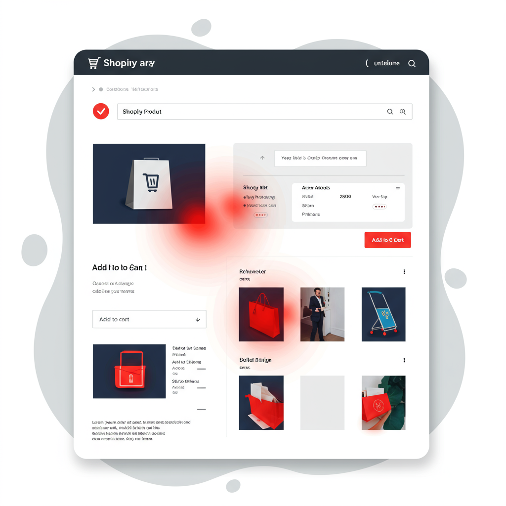
Discover how visual insights can transform your online store’s user experience and boost conversions.
Hello fellow Shopify merchants! I’m here today to talk about a powerful tool that has personally transformed how I approach optimizing my online store: heatmaps.
If you’ve ever wondered why customers aren’t clicking certain buttons, or if they’re even seeing your most important content, heatmaps provide the answers.
In essence, heatmaps are visual representations of user behavior on your website. They use a color-coded system, much like a weather map, to show where users click, scroll, and even move their mouse.
For us Shopify store owners, understanding how visitors interact with our site is paramount to improving the user experience (UX) and, ultimately, boosting conversions.
I’ve found that relying solely on traditional analytics, while valuable, often leaves gaps in understanding the ‘why’ behind the numbers. Heatmaps fill those gaps beautifully.
Let’s dive into the main types of heatmaps you’ll encounter and how I use them. First up are Click Maps.
Click maps show exactly where users click on a page. Hotter colors (red, orange) indicate more clicks, while cooler colors (blue, green) show fewer clicks.
I use click maps to identify popular elements, but more importantly, to spot ‘dead clicks’ – instances where users click on non-clickable elements, indicating confusion or a desire for more information.
Next, we have Scroll Maps. These maps reveal how far down a page users scroll. They’re invaluable for understanding content engagement and identifying the ‘fold.’
The ‘fold’ is the point on your page where content becomes visible without scrolling. I always check my scroll maps to ensure critical information and calls to action are above the fold or strategically placed.
If I see a significant drop-off in scrolling at a certain point, it tells me that content isn’t engaging enough, or perhaps the page is too long.
Then there are Move Maps, sometimes called Hover Maps. These track mouse movements, which often correlate with eye-tracking, giving me insights into what users are looking at.
While not as definitive as clicks or scrolls, I find move maps useful for understanding general attention areas and how users scan a page before taking action.
So, why are these tools so crucial for a Shopify store? It boils down to optimizing every touchpoint in the customer journey.
I use heatmaps to scrutinize my product pages. Are customers seeing the ‘Add to Cart’ button? Are they engaging with product images and descriptions?
On collection pages, I analyze if my product grid layout is effective and if users are clicking on the right filters or sorting options.
Even the cart and checkout pages benefit. I look for areas of hesitation or confusion that might lead to abandoned carts.
Implementing heatmaps on Shopify is surprisingly straightforward. Many popular heatmap tools like Hotjar, Crazy Egg, or Microsoft Clarity offer direct Shopify app integrations.
If an app isn’t available, I usually just copy and paste a small tracking code into my theme’s `theme.liquid` file, typically before the closing “ tag.
Once the data starts flowing in, the real work begins: analysis. I don’t just look at the pretty colors; I ask ‘why?’
For instance, if a scroll map shows low engagement on a product description, I consider shortening it, adding bullet points, or moving key benefits higher up.
If a click map reveals many clicks on an image that isn’t clickable, I might make it clickable to a gallery or a detailed view.
I also cross-reference heatmap data with my Shopify analytics. High bounce rate on a page combined with low scroll depth on its heatmap tells me there’s a serious engagement issue.
One actionable insight I gained was moving my ‘Add to Cart’ button higher on mobile product pages after seeing low scroll rates on smaller screens. Conversions improved significantly!
Another time, I noticed users repeatedly clicking on a decorative icon. I realized they thought it was a link to more information, so I turned it into one.
My advice is to focus on your most important pages first: homepage, top-selling product pages, collection pages, and the cart/checkout flow.
Remember, heatmaps are a diagnostic tool. They show you *what* is happening. It’s up to you to hypothesize *why* and then implement changes.
Always test your changes! A/B testing tools can help you confirm if your heatmap-inspired optimizations actually lead to better results.
I also make sure to regularly monitor my heatmaps, especially after any major site redesigns or new product launches. User behavior can evolve.
While incredibly powerful, heatmaps aren’t a magic bullet. They should be used in conjunction with other analytics, user surveys, and qualitative feedback.
Privacy is also a key consideration. Most heatmap tools offer options to anonymize data and suppress sensitive information, which I always enable.
In conclusion, integrating heatmaps into your Shopify optimization strategy is one of the most impactful decisions you can make for your store’s UX.
They provide unparalleled visual insights into how your customers interact with your site, allowing you to make data-driven decisions that truly enhance their shopping experience.
I’ve seen firsthand how these insights translate into higher engagement, lower bounce rates, and ultimately, more sales.
So, if you haven’t already, I strongly encourage you to explore heatmap tools for your Shopify store. You’ll be amazed at what you discover.
What do you think about this article and the power of heatmaps for Shopify stores? I’d love to hear your thoughts!


