Moving Beyond Basic Metrics to Understand Customer Behavior and Drive Growth
Hello fellow merchants! Today, I want to dive deep into a powerful analytical technique that can truly transform how you understand your Shopify store’s performance: Cohort Analysis.
You see, while Shopify’s built-in analytics provide a wealth of information, they often show you the “what” – total sales, average order value, conversion rates.
But what if you want to understand the “who” and the “why” behind those numbers? This is where cohort analysis shines.
At its core, cohort analysis involves grouping your customers based on a shared characteristic, typically the time they first interacted with your store or made their first purchase.
Imagine grouping all customers who made their first purchase in January 2023. That group is a “cohort.”
Then, you track their behavior over time, observing how they continue to engage, purchase, or churn in subsequent months.
This approach allows us to move beyond aggregate metrics and see how different groups of customers behave differently.
Why is this so crucial for your Shopify business? Because it helps you answer critical questions about customer retention, lifetime value (LTV), and the effectiveness of your marketing efforts.
For instance, did customers acquired during a specific marketing campaign in Q4 behave differently than those acquired organically in Q1? Cohort analysis can tell you.
It helps you identify your most valuable customer segments and understand what makes them stick around, or conversely, why others might leave.
Unfortunately, Shopify doesn’t offer a native, built-in cohort analysis tool directly within its analytics dashboard.
But don’t despair! With a little effort and the power of spreadsheets, you can absolutely perform robust cohort analysis for your store.
The first step is to gather your data. You’ll primarily need your customer list and order history, which you can export from your Shopify admin.
Look for reports like “Customers” and “Orders” and export them as CSV files. These files contain the raw data we need.
Once you have your data in a spreadsheet program like Google Sheets or Microsoft Excel, the real work begins.
You’ll want to identify the “acquisition month” or “acquisition week” for each customer – this is usually the date of their very first order.
This date will define which cohort each customer belongs to. For example, if a customer’s first order was on January 15, 2023, they belong to the “January 2023 Cohort.”
Next, you’ll track their subsequent purchases. For each customer, note down the dates of all their orders.
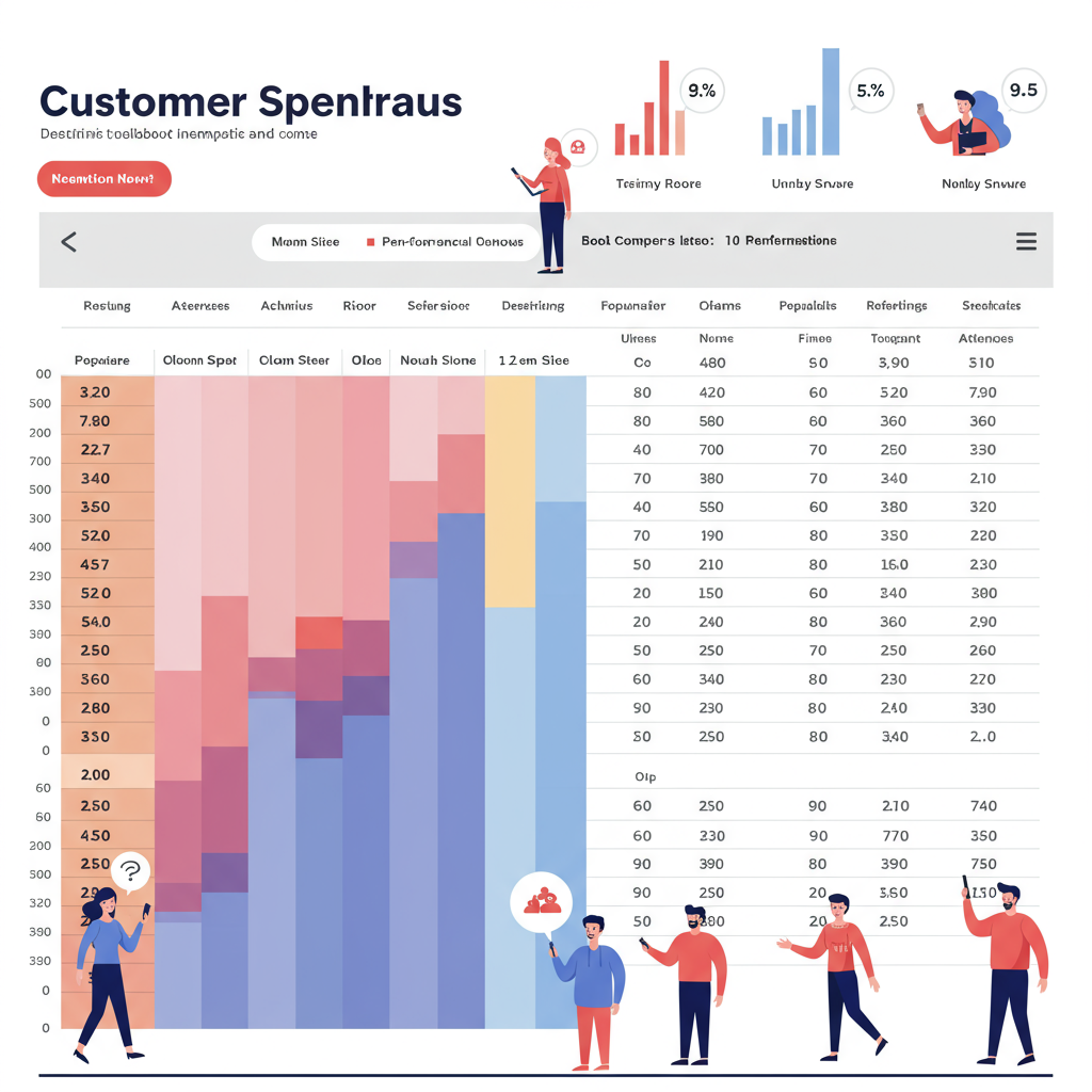
The goal is to build a table where rows represent cohorts (e.g., Jan 2023, Feb 2023) and columns represent subsequent months or periods after their acquisition.
Within each cell, you can then calculate various metrics: the percentage of customers from that cohort who made a second purchase, a third purchase, or the average revenue generated by that cohort over time.
This is where you’ll start to see patterns. Are customers acquired in certain months more likely to return? Do specific marketing channels lead to higher retention rates?
For example, you might find that customers acquired through Instagram ads in March have a significantly higher 3-month retention rate than those acquired via Google Ads in April.
This insight is gold! It tells you where to double down your marketing spend and what kind of customers are truly valuable in the long run.
You can also calculate the average Customer Lifetime Value (LTV) for each cohort. This helps you understand which acquisition strategies bring in customers who spend more over their lifetime with your brand.
By comparing LTV across cohorts, you can refine your customer acquisition costs (CAC) and ensure you’re investing wisely.
What do you think about this approach to understanding your customer base? I’d love to hear your thoughts.
Beyond retention and LTV, cohort analysis can also reveal churn patterns. When do customers typically stop buying? Is there a specific point where a significant drop-off occurs?
Identifying these churn points allows you to proactively implement strategies, like targeted email campaigns or loyalty programs, to re-engage customers before they leave.
Remember, the power of cohort analysis isn’t just in the numbers themselves, but in the actionable insights you derive from them.
Use these insights to optimize your marketing campaigns, refine your product offerings, improve your customer service, and even adjust your pricing strategies.
While manual spreadsheet analysis can be time-consuming, it provides an unparalleled depth of understanding.
There are also third-party Shopify apps and business intelligence tools that can automate some of this for you, but understanding the underlying principles is key regardless.
Start small, perhaps by analyzing just a few recent cohorts, and gradually expand your analysis as you become more comfortable.
The effort you put into understanding your customer cohorts will pay dividends in the form of more effective marketing, higher customer retention, and ultimately, a more profitable Shopify store.
It’s about moving from reactive decision-making to proactive, data-driven growth.


