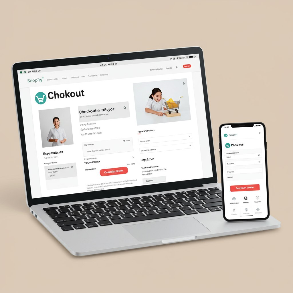
Unlock the secrets to a seamless and high-converting Shopify checkout experience for your customers.
As a merchant, I’ve learned that the journey from product discovery to purchase is fraught with potential pitfalls. We spend so much time perfecting our product pages, crafting compelling descriptions, and driving traffic, but often, the final hurdle – the checkout process – is overlooked.
I’ve personally seen how a clunky, confusing, or slow checkout can lead to a significant number of abandoned carts, turning eager customers into frustrated visitors. It’s a painful experience to watch potential sales slip away at the very last moment.
This is why I’m so passionate about optimizing the Shopify checkout experience. It’s not just about aesthetics; it’s about building trust, reducing friction, and ultimately, boosting your conversion rates. Every improvement here directly impacts your bottom line.
First and foremost, speed is paramount. In today’s fast-paced digital world, customers expect instant gratification. A slow-loading checkout page is a guaranteed way to lose sales. I always prioritize optimizing my site’s loading times.
This means compressing images, minifying CSS and JavaScript, and leveraging browser caching. Shopify’s infrastructure is robust, but our themes and apps can sometimes add bloat. Regularly auditing your site’s performance is crucial.
Next, consider the mobile experience. A vast majority of online shopping now happens on smartphones. If your checkout isn’t perfectly optimized for mobile, you’re alienating a huge segment of your audience. I always design with mobile in mind first.
This includes large, tappable buttons, clearly legible text, and form fields that are easy to navigate with a thumb. Avoid tiny checkboxes or dropdowns that are difficult to interact with on a small screen.
One of the biggest debates is guest checkout versus requiring account creation. From my experience, offering a guest checkout option is almost always better for conversion. Customers want speed and convenience, not another password to remember.
When it comes to form fields, less is always more. Only ask for essential information. Every extra field is a potential point of friction. I’ve found that simplifying forms dramatically reduces abandonment rates.
Implement auto-fill features for addresses and payment details. Shopify’s native capabilities, especially with Shop Pay, are excellent for this. This saves customers valuable time and reduces typing errors.
Provide clear progress indicators. Customers like to know where they are in the checkout process and how many steps remain. A simple ‘Step 1 of 3’ or a visual progress bar can significantly reduce anxiety.
Trust is foundational. Display security badges (SSL certificates, payment gateway logos), customer testimonials, or review snippets prominently. Reassure your customers that their data is safe and their purchase is secure.
Be completely transparent about pricing. Hidden fees, unexpected shipping costs, or taxes that only appear at the very last step are major conversion killers. Show the full cost upfront, or at least clearly explain how it’s calculated.
Offer a variety of payment options. While credit cards are standard, many customers prefer digital wallets like PayPal, Apple Pay, Google Pay, or Shopify’s own Shop Pay. The more options you provide, the wider your appeal.
I cannot stress enough the power of Shop Pay. It’s incredibly fast and convenient for customers who have used it before, often completing a purchase in just a few taps. Activating it is a no-brainer for any Shopify merchant.
Clear and helpful error messages are crucial. If a customer makes a mistake, don’t just say ‘Error.’ Tell them exactly what went wrong (e.g., ‘Please enter a valid email address’ or ‘Card declined: check your details’).
While not strictly part of the checkout flow, consider a tasteful exit-intent pop-up on the cart page or early checkout steps. Offer a small discount or free shipping to entice hesitant customers to complete their purchase. Use this sparingly and wisely.
Clearly outline your shipping options, costs, and estimated delivery times early in the process. Ambiguity here can lead to frustration and abandonment. Offer different tiers if possible (e.g., standard, express).
Make your returns policy easily accessible, perhaps with a link in the footer of the checkout page. Knowing they can return an item if needed builds confidence in the purchase.
The experience doesn’t end at the ‘Thank You’ page. A well-designed order confirmation email, clear shipping updates, and easy access to tracking information enhance the overall customer journey and encourage repeat business.
Consider strategic post-purchase upsells or downsells. Shopify’s native features or apps can help you offer complementary products *after* the main purchase is complete, without disrupting the primary checkout flow.
Don’t just set it and forget it. Continuously A/B test different elements of your checkout. Try different button colors, field labels, or trust badge placements. Small changes can yield significant results.
Dive deep into your Shopify analytics. Look at your checkout funnel reports to identify exactly where customers are dropping off. Is it at the shipping information step? The payment step? This data is invaluable for targeted improvements.
Improving your checkout UX is an ongoing process. The digital landscape evolves, and so should your store. Stay informed about new features and best practices.
What are your biggest challenges or successes when it comes to optimizing your Shopify checkout? I’d love to hear your thoughts!
In summary, a high-converting Shopify checkout is fast, mobile-friendly, transparent, trustworthy, and offers flexible payment options. It minimizes friction and maximizes convenience for your customers.
By focusing on these key areas, you’re not just improving a technical process; you’re enhancing the entire customer experience, building loyalty, and ultimately, driving more sales for your business. It’s an investment that truly pays off.


