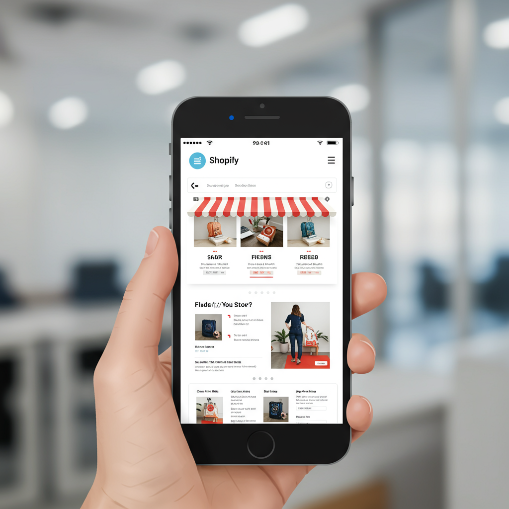
Unlocking Success in a Mobile-Dominated World
As a merchant in today’s digital landscape, I’ve come to realize one undeniable truth: the vast majority of our customers are browsing, discovering, and purchasing from their mobile devices. It’s no longer just a trend; it’s the primary way people interact with online stores.
This fundamental shift in consumer behavior means that if your Shopify store isn’t optimized for mobile first, you’re not just missing out on sales; you’re actively deterring potential customers. My goal with this article is to share my insights and strategies for building a truly mobile-first Shopify experience.
When I say “mobile-first,” I’m not just talking about a responsive design that adapts to smaller screens. While responsiveness is crucial, a mobile-first approach means designing and building your store with the smallest screen in mind *from the very beginning*.
It’s about prioritizing content, functionality, and user experience for mobile users, then scaling up for larger screens. This mindset ensures that the core experience is always excellent, regardless of the device.
So, why is this so critical? Think about your own habits. How often do you reach for your phone versus your desktop when you want to quickly check something or make a purchase? For most of us, it’s our phones.
Google itself uses mobile-first indexing, meaning it primarily uses the mobile version of your content for indexing and ranking. A poor mobile experience can directly impact your search engine visibility.
Beyond search engines, a clunky mobile site leads to frustration, high bounce rates, and abandoned carts. I’ve seen firsthand how a smooth mobile experience translates directly into higher conversion rates and happier customers.
Let’s dive into the practical steps I take to ensure my Shopify stores are truly mobile-first. The first and most foundational step is choosing the right theme.
Shopify offers a plethora of themes, both free and paid. When selecting one, I always look for themes explicitly advertised as “responsive” or “mobile-friendly.” However, I don’t stop there.
I thoroughly test the theme’s demo on my own mobile device, checking navigation, product pages, and the checkout flow. Does it feel intuitive? Are buttons easy to tap? Is text legible without zooming?
My next major focus is on speed. Mobile users are notoriously impatient. Every second counts. I’ve learned that large image files are often the biggest culprits for slow loading times.
I always compress my images before uploading them to Shopify. Tools like TinyPNG or Shopify’s built-in image optimization can help significantly. I also consider using next-gen formats like WebP where possible.
Beyond images, I review any apps or custom code I’ve added. While apps can enhance functionality, too many or poorly coded ones can drastically slow down your site. I regularly audit my app usage, removing anything that isn’t essential.
Navigation is another critical area. On mobile, screen real estate is limited. I advocate for clear, concise navigation menus, often utilizing a “hamburger” icon for a clean look.
The menu structure itself should be simple and logical. I try to limit the number of top-level categories and use clear, descriptive labels. My goal is for a customer to find what they’re looking for in just a few taps.
Product pages are where the magic happens. On mobile, I focus on presenting key information immediately. This means high-quality product images that are zoomable, but also load quickly.
Product descriptions should be concise and scannable. I use bullet points for key features and benefits, saving longer narratives for a “read more” toggle or a separate tab. The “Add to Cart” button must be prominent and easy to tap.
The checkout process is arguably the most crucial part of the mobile experience. Any friction here can lead to abandonment. I ensure my checkout is as streamlined as possible.
This means minimizing the number of steps, enabling autofill for addresses, and offering popular mobile payment options like Apple Pay or Google Pay. I also make sure guest checkout is an option.
I also pay close attention to form fields. Are they large enough to tap? Is the keyboard type appropriate (e.g., numeric for phone numbers)? These small details make a huge difference.
Testing, testing, and more testing! This is a continuous process for me. I regularly test my store on various mobile devices and browsers. I use tools like Google’s Mobile-Friendly Test and PageSpeed Insights to identify areas for improvement.
I also encourage friends and family to browse my store on their phones and provide honest feedback. Sometimes, an outside perspective can spot issues I’ve overlooked.
What are your biggest challenges when optimizing your Shopify store for mobile? I’d love to hear your thoughts and experiences.
Finally, I constantly monitor my Shopify analytics, paying close attention to mobile conversion rates, bounce rates, and time on site. These metrics provide invaluable insights into what’s working and what needs further refinement.
Remember, a mobile-first approach isn’t a one-time fix; it’s an ongoing commitment. The mobile landscape is constantly evolving, and so too should your store.
By prioritizing the mobile user experience, you’re not just adapting to current trends; you’re future-proofing your business and building a stronger, more accessible brand.
I truly believe that investing in a superior mobile experience is one of the most impactful decisions you can make for your Shopify store’s success. It’s about meeting your customers where they are, and making their journey as effortless as possible.
So, take these steps, implement them diligently, and watch your mobile conversions soar. Your customers, and your bottom line, will thank you for it.


