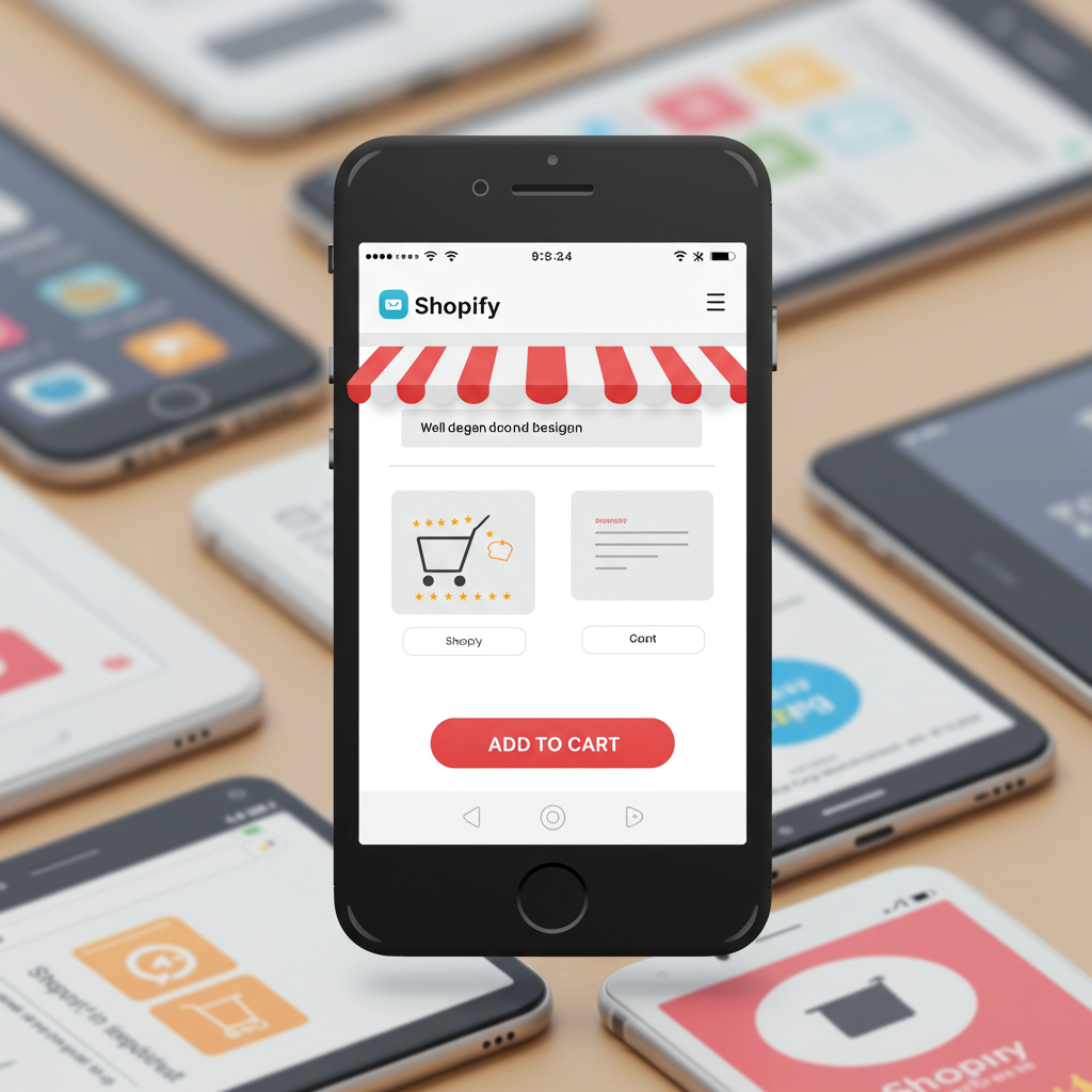
Why optimizing for smartphones isn’t just an option, but a necessity for e-commerce success in today’s digital landscape.
Hello fellow Shopify merchants! Today, I want to talk about something incredibly crucial for your online store’s success: designing for a mobile-first world. It’s no longer just a trend; it’s the standard.
When I first started my e-commerce journey, desktop was king. But times have changed dramatically. Now, the vast majority of online browsing and purchasing happens on smartphones and tablets.
Think about your own habits. How often do you reach for your phone to quickly check a product, compare prices, or make an impulse buy? My guess is, quite often. Your customers are doing the same.
This shift means that if your Shopify store isn’t optimized for mobile devices, you’re not just missing out on sales; you’re actively deterring potential customers. A clunky mobile experience is a conversion killer.
So, what exactly does “mobile-first design” mean? It’s not just about making your desktop site shrink to fit a smaller screen. It’s about designing for the smallest screen *first*, then progressively enhancing for larger screens.
This approach forces you to prioritize. On a small screen, every pixel counts. You have to decide what information is absolutely essential and present it clearly and concisely.
My first piece of advice is to choose a mobile-responsive Shopify theme. Most modern themes are built with responsiveness in mind, but it’s vital to double-check and test them thoroughly.
Look for themes that boast clean layouts, fast loading times, and intuitive navigation on mobile. Don’t just assume; preview them on your own phone before committing.
Once you have your theme, let’s talk about content. Product images are paramount. They need to be high-quality, but also optimized for web. Large image files will significantly slow down your mobile site.
I always recommend compressing images without sacrificing too much quality. Shopify has some built-in optimization, but external tools can help further. Think about aspect ratios that look good on mobile.
Product descriptions should be concise and scannable. On a mobile screen, long blocks of text are overwhelming. Use bullet points, short paragraphs, and clear headings to break up information.
Your Call-to-Action (CTA) buttons – like “Add to Cart” – must be prominent and easy to tap. They should be large enough for a finger, not a mouse cursor, and clearly stand out.
Navigation is another critical area. The classic “hamburger menu” (three horizontal lines) is almost universally recognized on mobile. Ensure your menu is well-organized and doesn’t have too many layers.
I’ve found that sticky headers, where the navigation or “Add to Cart” button remains visible as the user scrolls, can significantly improve the mobile shopping experience.
The checkout process is where many mobile sales are lost. It needs to be as streamlined as possible. Minimize the number of steps and form fields.
Shopify’s native checkout is generally well-optimized for mobile, but if you’re using third-party apps that modify the checkout, test them rigorously on various devices.
Consider offering mobile payment options like Apple Pay, Google Pay, or Shop Pay. These one-tap solutions drastically reduce friction and boost conversion rates on mobile.
Speed is king on mobile. Users expect pages to load almost instantly. I use tools like Google PageSpeed Insights and Shopify’s own performance reports to identify and fix bottlenecks.
Beyond images, app bloat can slow down your site. Review your installed Shopify apps. Do you really need all of them? Each app adds code, which can impact loading times.
Test, test, test! This is perhaps the most important step. Don’t just rely on your desktop browser’s mobile view. Grab your phone, your tablet, and ask friends to test on theirs.
Check different operating systems (iOS, Android) and browsers (Safari, Chrome, Firefox). Look for broken layouts, slow loading, and difficult interactions.
Pay attention to accessibility. Ensure text is readable, contrast is good, and interactive elements are large enough for everyone, including those with visual or motor impairments.
Finally, monitor your analytics. Shopify’s analytics, combined with Google Analytics, can show you how mobile users are interacting with your site. Where are they dropping off? What pages are popular?
Use this data to continuously refine your mobile experience. It’s not a one-time setup; it’s an ongoing process of improvement.
What do you think about these strategies? Have you implemented any of them, or do you have other mobile-first tips to share? I’d love to hear your thoughts.
By prioritizing mobile-first design, you’re not just keeping up with the times; you’re actively investing in a superior customer experience that will translate directly into higher engagement and, ultimately, more sales for your Shopify store.
Remember, your phone is often the first, and sometimes only, touchpoint your customers have with your brand. Make that first impression count.


