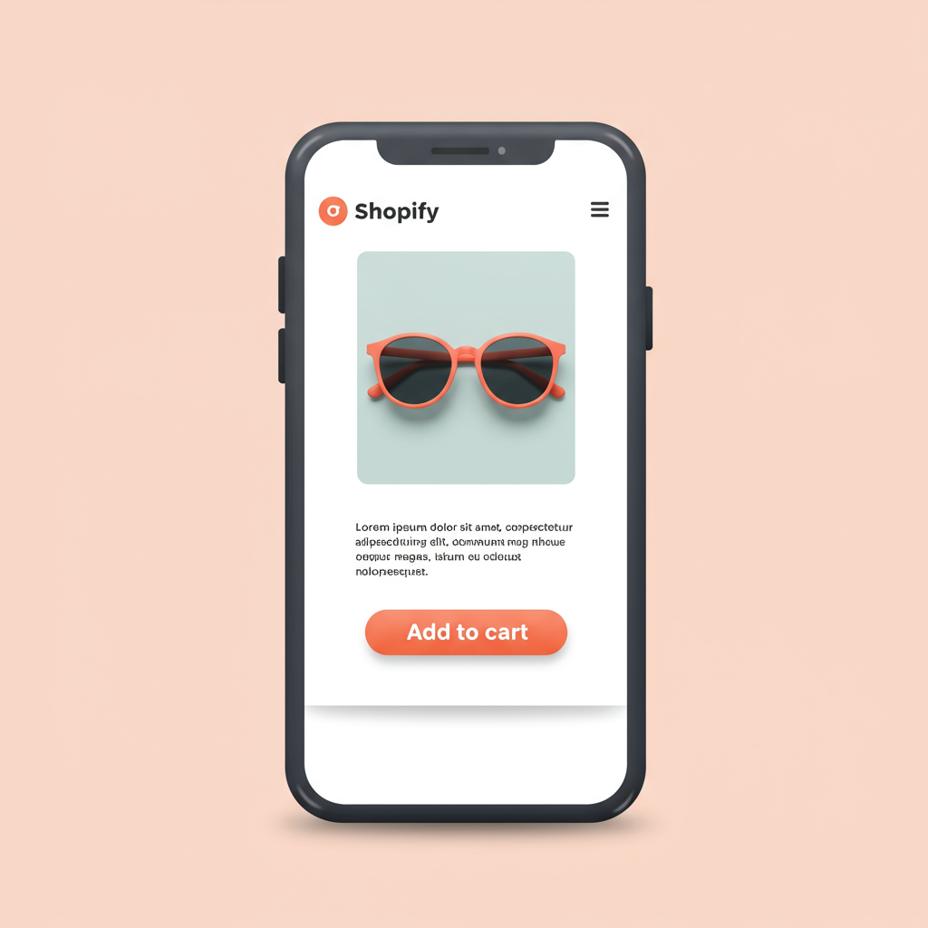
Unlock higher conversions by designing your e-commerce experience for the smartphone generation.
Hello fellow Shopify merchants! Today, I want to talk about something incredibly crucial for your online store’s success: designing for mobile first.
In my experience, many of us still think about desktop design as the primary focus, then adapt for mobile. But the truth is, that approach is outdated and can cost you dearly.
The vast majority of online traffic, especially in e-commerce, now comes from mobile devices. Your customers are browsing, discovering, and buying on their phones, often on the go.
If your Shopify store isn’t optimized for these users from the ground up, you’re not just losing sales; you’re creating a frustrating experience that drives potential customers away.
A mobile-first approach means you design the smallest screen experience first, then progressively enhance it for larger screens. It’s about prioritizing content and functionality.
When I started implementing this mindset, I realized it forces you to be ruthless about what truly matters on your product pages and throughout your entire site.
The core principles I always keep in mind are simplicity, speed, and intuitive navigation. Mobile users are often on the go, with limited attention spans and sometimes slower connections.
First, let’s talk about your Shopify theme. This is your foundation. Always choose a theme that is inherently responsive and built with mobile performance in mind.
Shopify’s theme store offers many excellent options. Look for themes that boast about their mobile performance, clean layouts, and fast loading times.
Once you have your theme, image optimization becomes paramount. Large, unoptimized images are the number one killer of mobile load times and user patience.
I always compress my images before uploading them to Shopify. Tools like TinyPNG or Shopify’s built-in image optimization can help immensely, reducing file sizes without noticeable quality loss.
Consider using next-gen formats like WebP if your theme supports them, as they offer superior compression compared to traditional JPEGs or PNGs, further speeding up your site.
Next, navigation. On mobile, screen real estate is precious. Avoid cluttered menus. A clean, intuitive hamburger menu is often the best solution for tucking away extensive navigation.
Ensure your main categories are easily accessible and that the search bar is prominent. Mobile users often know what they’re looking for and want to find it quickly.
Product pages are where the magic happens. On mobile, focus on clear, concise product descriptions. Bullet points work wonders for readability, highlighting key features and benefits.
High-quality product images are still essential, but ensure they load quickly and are easily zoomable with touch gestures. Multiple angles and lifestyle shots are a plus.
The “Add to Cart” button needs to be large, prominent, and easy to tap. It should stand out from the rest of the content and be visible without excessive scrolling.
Think about the checkout process. This is where many mobile users abandon their carts due to friction. Simplify it as much as humanly possible.
Minimize the number of fields required. Offer guest checkout. Integrate popular mobile payment options like Apple Pay, Google Pay, or Shop Pay for one-tap purchases.
I’ve found that reducing friction at checkout directly correlates with higher conversion rates on mobile. Every unnecessary click or field can lead to abandonment.
Don’t forget about touch targets. Buttons, links, and interactive elements should be large enough to be easily tapped with a finger, not a precise mouse cursor.
This also extends to forms. Make sure form fields are large, clearly labeled, and that the keyboard type automatically adjusts (e.g., numeric for phone numbers, email for email addresses).
What do you think about these mobile-first strategies so far? Have you implemented any of them, or do you have other tips you’ve found effective?
Finally, testing is non-negotiable. I regularly test my Shopify store on various mobile devices – different screen sizes, operating systems, and browsers.
Use Shopify’s mobile preview, Google’s Mobile-Friendly Test, and actual physical devices. Pay attention to how elements render and how fast pages load.
Monitor your analytics. Look at mobile conversion rates, bounce rates, and time on site. These metrics will tell you exactly where you need to improve and where your efforts are paying off.
Implementing a mobile-first design isn’t just a trend; it’s a fundamental shift in how we approach e-commerce. It’s about meeting your customers where they are, on their preferred device.
By prioritizing the mobile experience, you’re not just making your store look good; you’re building a more accessible, faster, and ultimately more profitable business.
So, take the leap. Start optimizing your Shopify store for mobile first today. Your customers, and your sales, will thank you for it.


