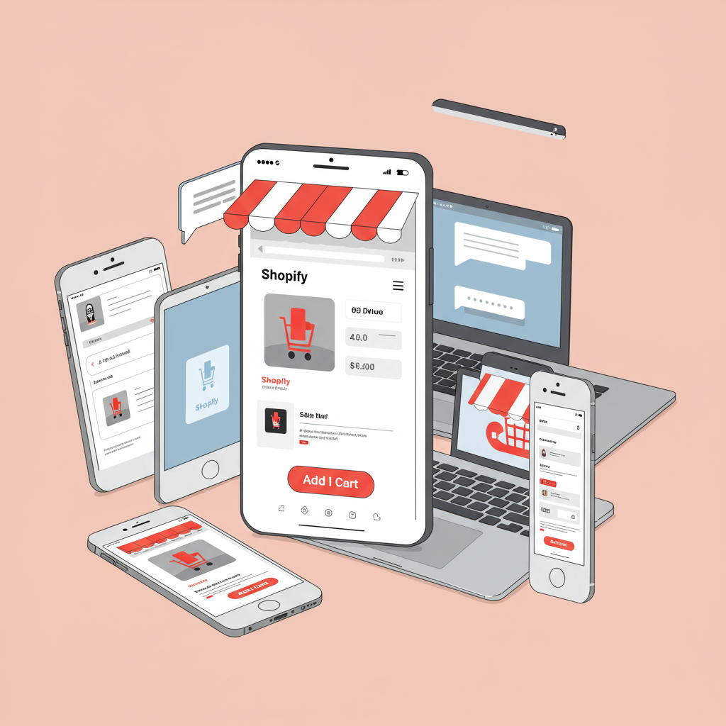
My Essential Guide to Designing for the Small Screen First
As a Shopify merchant, you’re constantly looking for ways to enhance your store’s performance and reach more customers. In today’s digital landscape, one truth stands out above all others: mobile is king.
I’ve seen firsthand how a mobile-first approach can transform an online business, boosting conversions and customer satisfaction significantly. It’s no longer just a nice-to-have; it’s an absolute necessity.
Think about your own habits. How often do you browse, research, or even make purchases directly from your smartphone? Chances are, it’s a lot. Your customers are doing the same.
This is why I firmly believe that designing your Shopify store with a mobile-first mindset isn’t just a strategy; it’s the foundation for future success. It means building for the smallest screen first, then scaling up.
My journey into mobile-first design began when I noticed a significant portion of my traffic coming from mobile devices, yet my conversion rates on those devices lagged behind desktop. It was a clear signal.
The core principle I adopted was “content prioritization.” On a small screen, every pixel counts. You must decide what information is absolutely essential and present it clearly and concisely.
This often means stripping away clutter. I learned to be ruthless with elements that didn’t directly contribute to the user’s journey or the product’s value proposition. Simplicity became my mantra.
Speed is another non-negotiable aspect. Mobile users are notoriously impatient. If your store takes more than a few seconds to load, you’re losing potential sales. I focused heavily on image optimization and efficient code.
When choosing a Shopify theme, I always look for one that is inherently responsive. While most modern themes claim to be, I dig deeper, checking their mobile performance and layout on various devices during the demo.
My advice is to test themes rigorously. Use Shopify’s theme customizer to preview on mobile, but also use real devices or browser developer tools to simulate different screen sizes.
Image optimization is paramount. Large, unoptimized images are often the biggest culprits for slow load times. I use tools to compress images without sacrificing quality, and I leverage Shopify’s built-in image resizing capabilities.
For product images, I ensure they are high-resolution but also appropriately sized for web. I also consider using WebP format where supported for even better compression.
Navigation needs to be intuitive and touch-friendly. The ubiquitous “hamburger menu” is a standard for a reason on mobile. I make sure it’s easy to tap and that the menu items are clearly labeled and well-organized.
I also consider sticky headers or footers for important elements like the cart icon or search bar, making them accessible without constant scrolling.
Product pages are where the magic happens. On mobile, I focus on clear, concise product descriptions that highlight benefits. Bullet points work wonders for readability.
High-quality product photos are even more critical on mobile. I ensure they are zoomable and that customers can easily swipe through multiple angles. Videos, if short and optimized, can also be very effective.
The “Add to Cart” button must be prominent, easy to tap, and ideally, above the fold. I make sure it contrasts well with the background and is large enough for a thumb.
The checkout process is often the make-or-break point. I strive for as few steps as possible. Shopify’s native checkout is generally well-optimized, but I still review it.
I enable guest checkout to remove barriers and ensure autofill options are working correctly. Offering multiple popular payment methods, including mobile-specific ones like Apple Pay or Google Pay, is also crucial.
After implementing changes, I always conduct thorough testing. I use my own phone, my tablet, and ask friends or family to test on their devices. I also use Google’s Mobile-Friendly Test tool.
Shopify’s analytics provide invaluable insights. I regularly check my mobile conversion rates, bounce rates, and time on site. These metrics tell me what’s working and what needs further refinement.
There are also many Shopify apps designed specifically for mobile optimization, from speed boosters to enhanced mobile navigation. I research and test these carefully to see if they add value without adding bloat.
Beyond the basics, I’ve started exploring Progressive Web Apps (PWAs) for my store. While a more advanced topic, PWAs offer app-like experiences directly from the browser, which can significantly enhance mobile engagement.
For my blog content, I’ve looked into Accelerated Mobile Pages (AMP). AMP can make blog posts load almost instantly on mobile, improving the reading experience and potentially SEO.
Finally, I consider voice search optimization. As more people use voice assistants, ensuring your product names and descriptions are natural language-friendly can open up new avenues for discovery.
What do you think about these strategies? Have you implemented any of them, and what were your results? I’d love to hear your experiences.
In conclusion, embracing a mobile-first design for your Shopify store isn’t just about keeping up with trends; it’s about meeting your customers where they are. It’s about providing a seamless, enjoyable, and efficient shopping experience.
By prioritizing speed, simplicity, and touch-friendliness, and by continuously testing and iterating, you’ll build a robust online presence that thrives on every device. Your customers, and your bottom line, will thank you for it.


