Shopify Homepage Design: Sections, Order, What to Leave Out

Good Shopify homepage design comes down to a few sections in the right order: a hero that says what you sell and links to it, a way into your main collections, a handful of best sellers, proof that the store is real, and a footer that answers delivery and returns questions. Build it from your theme’s sections in the theme editor, keep the number of sections low because Shopify warns that many sections slow pages, and check every text block against Shopify’s contrast rules.
Facts come from the Shopify Help Center pages on theme accessibility, web performance, the theme editor and behavior reports, read on October 23, 2026, and Shopify’s Spring ’26 Edition for Rollouts.
The job of a homepage
Visitors from search results and ads can land straight on a product page, so the homepage mainly serves people who come for your brand: by typing your name, from social media or from a link. They want to know quickly what you sell, whether it is for them, and where to click. Check how many sessions actually start on it in the Sessions by landing page report before you spend a week on it.
Section by section
| Section | Its job | What to put in it | Mobile note |
|---|---|---|---|
| Announcement bar | One message that matters now | Free-shipping threshold, delivery cut-off, or a current sale | One line; no rotating messages |
| Header and menu | Get people into the catalog | Your main collections, search, account and cart | Check the menu opens with one tap |
| Hero | Say what you sell, show it, link to it | One image of your product in use, a headline that names the product type, one button to the main collection | Use an image that still works when cropped to a phone’s width |
| Collection list | Let visitors choose their way in | 3–6 collections with clear names and images | Large tap targets |
| Featured products | Show what sells | 4–8 best sellers with prices | Two per row is readable |
| Proof | Show the store is real | Review stars or quotes from real customers, press logos you actually have, your shipping and returns promise | Short |
| Brand story | Why buy from you | Two or three sentences and one photo of the people or the workshop | Keep it short; link to an About page |
| Signup | Keep visitors you would lose | Newsletter signup with a clear reason to join | Avoid a second popup on top |
| Footer | Answer the practical questions | Contact, shipping, returns, policies, FAQ, social links | Group links so the footer is not a wall |
Leave out what slows the page and adds little: carousels with many slides, autoplay video above the fold, animations on every section, and duplicated sections that repeat the same products. The products, collections and texts in each section are edited from the same theme editor; our guide to customize Shopify without code covers sections and templates.
Accessibility and speed rules from Shopify
Shopify’s accessibility guidance, written with WCAG in mind:
- Body text and button text need a contrast ratio of at least 4.5:1 against the background.
- Headings and other large text (24 px and up) need at least 3:1.
- Text over images, including slideshows, banners and videos, needs the same ratios; some themes let you add a color overlay to improve contrast.
- Non-text elements such as input borders and icons need at least 3:1.
- Headings go in sequential order without skipping levels.
- Text should be large enough to read comfortably and left-aligned rather than justified.
And from its web performance guidance:
- Too many sections on a page template lower performance.
- Page transitions and animations can slow pages; compare performance with them on and off.
- Use an up-to-date theme; Shopify’s Horizon and Online Store 2.0 themes are free and optimized.
We check our own homepage at every width from 320 to 1920 pixels with an automated layout test after each change, because a header that wraps at one tablet width is easy to miss when you only look at two screens. A simpler version for any store: open the homepage on a phone, a tablet and a laptop after every edit. Speed fixes in depth are in Shopify speed optimization.
Measure and test it
- Sessions by landing page shows how many sessions start on the homepage.
- The Conversion rate breakdown report shows whether those visitors add to cart and reach checkout.
- Rollouts, from Shopify’s Editions, can publish a theme change at a scheduled time or as an A/B test, so you can compare a new hero or section order against the current one before keeping it.
Change one thing per test, such as the hero image or the order of two sections, and judge it by cart additions, not by how it looks to you. A deeper look at the homepage’s sections in the theme editor is in our Shopify homepage guide, and other store topics are in the running a store hub.
Frequently asked questions
What should be on a Shopify homepage? A clear hero that names what you sell and links to it, your main collections, a few best sellers with prices, proof such as real reviews, and a footer with contact, shipping, returns and policy links.
How many sections should a Shopify homepage have? As few as do the jobs above; the table lists nine, and not every store needs all of them. Shopify’s performance guidance warns that high numbers of sections on a page template lower web performance, so remove sections that repeat others.
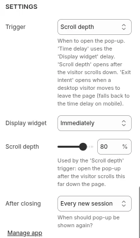
Should a Shopify homepage have a popup? A popup can collect first-time visitors’ emails if it waits for the right moment. Our app Pop Up Discount shows a popup that trades a discount code for the visitor’s email, triggered by time on page, scroll depth or exit intent and limited to the page types you choose. Avoid showing it the instant the page loads.