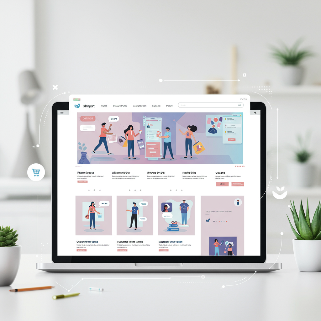
I’m here to share my top strategies for designing a high-converting Shopify homepage that resonates with your customers in the coming year.
Hello fellow merchants! I’m here today to talk about something incredibly vital for your online success: your Shopify homepage.
Think of your homepage as your digital storefront. It’s often the first impression a potential customer gets, and it needs to be compelling enough to make them stay and explore your offerings.
As we look towards 2026, the e-commerce landscape is evolving rapidly. What worked yesterday might not be as effective tomorrow, and staying ahead of the curve is paramount.
My goal with this article is to equip you with the insights and actionable tips I’ve gathered to design a Shopify homepage that not only looks great but also converts visitors into loyal customers.
One of the biggest shifts I foresee is the deeper integration of AI-driven personalization. Your homepage should dynamically adapt to individual visitor behavior, making their experience uniquely relevant.
To implement personalization, I recommend exploring Shopify apps that leverage AI to display tailored product recommendations, recent views, or even custom hero banners based on a visitor’s browsing history and preferences.
While this isn’t a new concept, its importance will only intensify: mobile-first design. I can’t stress enough that your homepage *must* be flawlessly responsive and optimized for mobile devices.
I always design with the smallest screen in mind first. Ensure touch targets are large enough, text is legible without zooming, and images load quickly on mobile data connections.
Google’s Core Web Vitals are not going anywhere. A slow homepage is a conversion killer, plain and simple. I prioritize speed above almost everything else when designing.
For speed optimization, I suggest compressing all images, minimizing the number of installed apps, leveraging lazy loading for media, and choosing a lightweight, performance-optimized Shopify theme.
The hero section is your prime real estate, the first thing visitors see. I always ensure my hero section clearly communicates my unique value proposition within seconds of a visitor landing.
Your hero section should include a high-quality, engaging image or video, a concise headline that grabs attention, a compelling sub-headline, and a clear, prominent Call-to-Action (CTA).
Your visitors need to find what they’re looking for effortlessly. I design my navigation to be intuitive, often utilizing mega menus for stores with larger and more complex product catalogs.
Don’t forget a highly visible and effective search bar. Many customers know exactly what they want and will head straight for the search function, so make it easy for them.
I strategically place sections for best-sellers, new arrivals, and curated collections. This helps guide visitors through my product offerings and highlights popular or timely items.
This goes without saying, but I’ll say it anyway: invest in professional product photography and lifestyle shots. They are crucial for conveying quality, building desire, and establishing trust.
I’ve seen incredible engagement from short, impactful videos on homepages – whether showcasing products in action, demonstrating features, or telling a quick brand story.
People trust other people. I always integrate customer reviews, testimonials, and trust badges prominently on my homepage to leverage social proof and build credibility.
Displaying security badges (like SSL certificates) and clear return policies can significantly boost visitor confidence and reduce perceived risk, encouraging them to proceed with a purchase.
Don’t just sell; connect. I dedicate a section to my brand’s mission, values, or a brief ‘About Us’ snippet to build rapport and allow customers to feel a connection with my brand.
Every section should ideally lead somewhere. I ensure my CTAs are action-oriented (e.g., ‘Shop Now,’ ‘Learn More’), visually distinct, and strategically placed where they’ll be most effective.
I believe in inclusive design. Your homepage should be accessible to everyone, including those with disabilities. This means proper alt text for images, keyboard navigation, and sufficient color contrast.
While not the primary SEO page, your homepage still benefits from basic optimization. I ensure my title tags, meta descriptions, and image alt text are relevant and keyword-rich.
Building an email list is paramount for long-term marketing. I strategically place a non-intrusive pop-up or a dedicated section for email sign-ups, often with an incentive like a discount.
Offering immediate support via live chat can significantly improve user experience and conversion rates. I always consider integrating this for real-time customer assistance.
Don’t overlook the footer. I ensure it contains essential links like contact information, privacy policy, terms of service, and social media links, making it easy for visitors to find crucial details.
My work isn’t done once the homepage is live. I constantly monitor analytics (like bounce rate and conversion rate) and run A/B tests to refine elements and continuously improve performance.
For many brands, communicating sustainability efforts is becoming a key differentiator. If it aligns with your brand, I recommend highlighting your eco-friendly practices or ethical sourcing on your homepage.
What do you think about this article? I’d love to hear your thoughts and any strategies you’ve found successful for your own Shopify homepage.
Designing a high-converting Shopify homepage for 2026 is an ongoing process. By focusing on user experience, future trends, and continuous optimization, I’m confident you can create a powerful digital storefront.
I encourage you to revisit your homepage with these tips in mind. Your customers, and your bottom line, will thank you for the effort.


